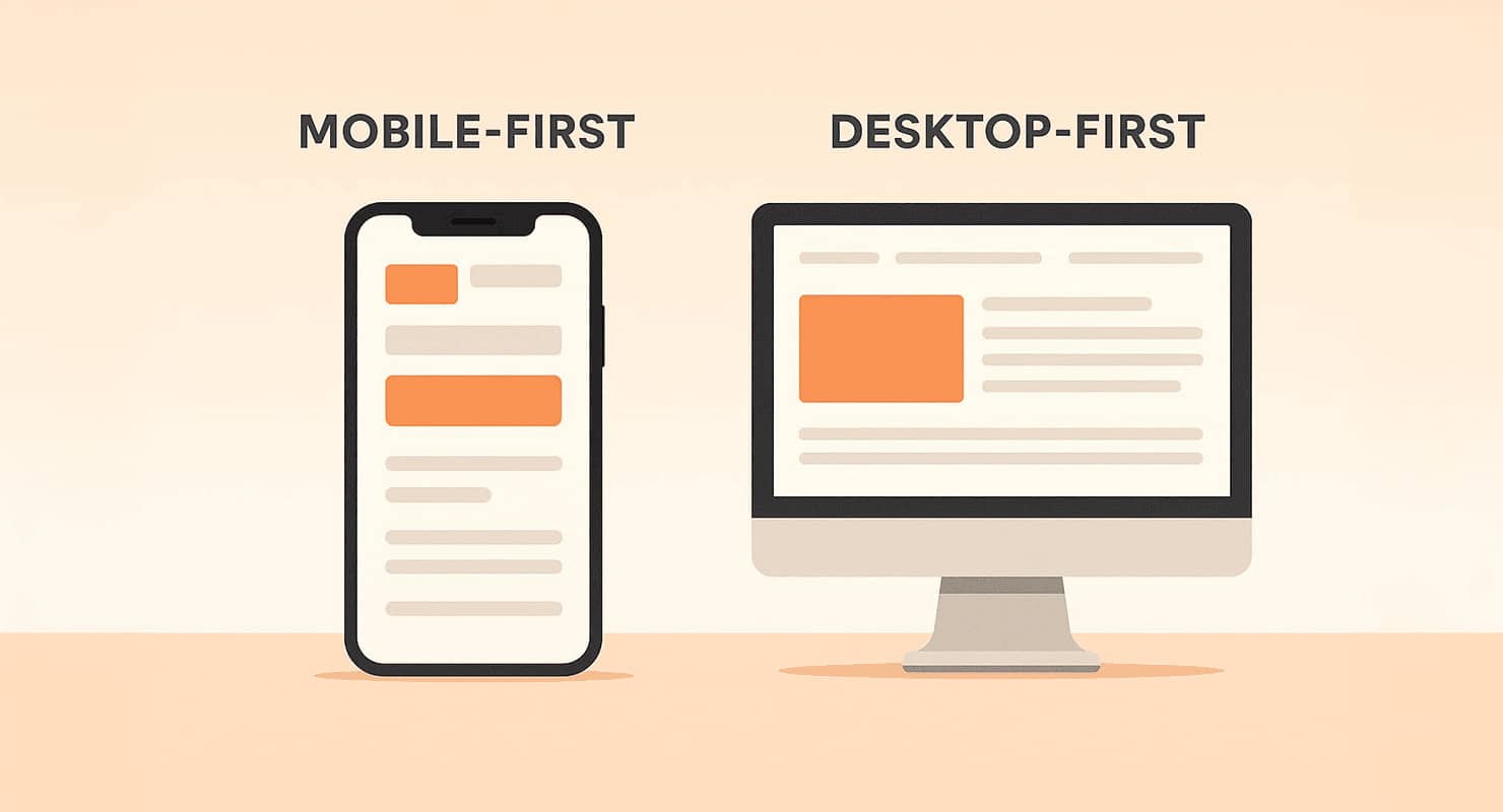
Mobile-First vs Desktop-First: Which Design Approach Works Best?

Mobile-First vs Desktop-First: Which Design Approach Works Best?
94% of Australians use mobile devices to browse the internet, and 53% of visitors leave websites that take over 3 seconds to load. For businesses in Western Sydney, choosing between mobile-first and desktop-first design is key to meeting user expectations and achieving business goals.
Key Takeaways:
- Mobile-First Design: Prioritises smaller screens, faster load times, and touch-friendly navigation. Ideal for high mobile traffic like retail or hospitality.
- Desktop-First Design: Focuses on larger screens, detailed layouts, and advanced features. Suited for industries like creative services or professional documentation.
Quick Comparison:
| Feature | Mobile-First | Desktop-First |
|---|---|---|
| Page Speed | Faster on mobile | Slower due to heavier assets |
| Layout | Single-column, fluid | Multi-column, fixed-width |
| Navigation | Simplified, touch-friendly | Complex, hover-based |
| SEO Performance | Better for mobile-first indexing | Challenges with mobile rankings |
| Best For | Quick, essential interactions | Detailed, feature-rich designs |
For most Western Sydney businesses, mobile-first design aligns with local trends. However, industries needing advanced features may benefit from a desktop-first approach - provided mobile optimisation is not overlooked.
Is Mobile-First Design Still Relevant in 2025?
Mobile-First vs Desktop-First: Core Differences
Understanding the differences between mobile-first and desktop-first designs can help Western Sydney businesses create more effective websites. These two approaches differ significantly in philosophy, implementation, and results.
Mobile-First Design Explained
Mobile-first design focuses on optimising websites for smartphones and tablets first, then scaling up for larger screens. This reflects the growing mobile usage in the region [1].
Key features of mobile-first design include:
- Simplified Content: Content is tailored for smaller screens, ensuring key messages and calls-to-action are prioritised.
- Faster Loading: Images and files are compressed to improve loading speeds. Research shows that 74% of users leave a mobile site if it takes more than 5 seconds to load [3].
- Touch-Friendly Design: Interfaces are built with touch in mind, using larger buttons and simplified navigation to enhance usability.
Desktop-first design, on the other hand, takes a different approach.
Desktop-First Design Explained
Desktop-first design begins by creating a feature-rich experience for larger screens. This approach works well for websites with detailed content or complex interactions, leveraging the capabilities of desktops and larger devices.
Here’s how the two approaches differ:
| Feature | Mobile-First | Desktop-First |
|---|---|---|
| Layout Structure | Single-column, fluid design | Multi-column, fixed-width |
| Content Density | Focused and minimal | Detailed and expansive |
| Typography | Larger, touch-friendly fonts | Smaller, intricate fonts |
| Load Speed | Smaller, optimised files | Larger, high-quality assets |
| Navigation | Simplified, hamburger menus | Expanded, detailed menus |
| User Input | Touch-optimised controls | Mouse and keyboard focused |
Desktop-first designs are ideal for websites requiring advanced features. However, scaling these down for mobile devices can sometimes lead to a less effective user experience.
"For a maintainable, future-friendly development methodology, I recommend that your default approach to mobile be to design one website that can adapt to different devices" [3].
For Western Sydney businesses, where mobile usage is high, a mobile-first approach can be a practical way to engage local customers effectively. Up next, we’ll delve into a side-by-side comparison of these approaches.
Direct Comparison of Both Approaches
Businesses in Western Sydney need to weigh the performance differences between mobile-first and desktop-first designs. Here's a breakdown of the strengths and limitations of each approach.
Mobile-First: Pros and Cons
Mobile-first design focuses on speed, simplicity, and prioritising core functionality.
Advantages:
- Faster load times for users
- Better SEO results aligned with local strategies
- Improved experience on smaller screens
- Higher conversion rates through streamlined content
- Clear emphasis on essential information
Challenges:
- Limited space for advanced features
- Additional development needed for desktop versions
- Fewer creative design options
- May feel overly simple on larger screens
Desktop-First: Pros and Cons
Desktop-first design is ideal for feature-rich experiences that take advantage of larger screens.
Advantages:
- Supports advanced features and detailed layouts
- Greater creative freedom for complex designs
- Suited for data-intensive applications
Challenges:
- Slower load times on mobile due to heavier assets
- Navigation can be awkward on touch devices
- Requires extra work to optimise for mobile users
Side-by-Side Feature Comparison
Here's a quick look at how the two approaches differ across key features:
| Feature | Mobile-First Impact | Desktop-First Impact |
|---|---|---|
| Page Load Speed | Faster on mobile | Slower due to larger assets |
| Content Display | Single-column, fluid layout | Multi-column, fixed-width design |
| Navigation | Touch-friendly, simplified menus | Complex menus with hover options |
| User Experience | Optimised for mobile | Richer features on desktop |
| SEO Performance | Better for mobile-first indexing | Challenges with mobile rankings |
| Development Time | Quicker to launch initially | Requires extra mobile adjustments |
"Mobile requires focus. You simply don't have room for all the extra crap that every single department head wants on the site. Starting with mobile creates a tremendous constraint that forces you to focus only on the essential, high-priority objectives." - Bruce Lawson, Smashing Magazine [3]
For businesses in Western Sydney, mobile-first design aligns well with current user habits and Google's mobile-first indexing. However, industries needing complex features may still benefit from desktop-first designs if they address mobile optimisation effectively.
Picking the Best Approach for Western Sydney Businesses
Choosing the right website design strategy means considering both local trends and specific business needs. Here's how to make an informed choice.
Local Device Usage Patterns
In Western Sydney, 94.1% of Australians aged 16–64 use mobile devices to browse the internet, spending around 3 hours daily on their phones. By 2024, smartphone penetration is expected to hit 86.6% [4].
Website Purpose and Design Choice
The purpose of your website should dictate your design strategy. Below is a breakdown of common business needs and the most suitable design approaches:
| Business Need | Recommended Approach | Why It Works |
|---|---|---|
| Local Retail | Mobile-First | High mobile search traffic |
| Professional Services | Desktop-First | Handles complex documentation |
| Hospitality | Mobile-First | Supports on-the-go bookings |
| Trade Services | Mobile-First | Easy access for emergencies |
| Creative Industries | Desktop-First | Best for showcasing portfolios |
These alignments help businesses cater to their audience's browsing habits effectively.
Western Sydney Market Considerations
Demographics and Behaviour
The data reveals:
- Mobile devices dominate how locals search and discover businesses.
- 94% of Australian smartphone users use their devices outside the home [4].
- Mobile preference continues to drive customer behaviour in the region [4].
Business Impact
With mobile usage shaping how people interact with businesses, most Western Sydney companies catering to local customers benefit from a mobile-first design. However, industries that rely on complex features or high-quality visuals - like professional services or creative industries - might lean towards a desktop-first approach, as long as their sites remain mobile-friendly.
"Mobile-first design shows that your business is forward-thinking and focused on providing the best possible experience for users." [2]
Analysing your website's current traffic and user behaviour can help you make the right decision. Look at what devices your audience uses most and ensure your site delivers both functionality and a seamless experience.
Design Approach Selection Guide
When to Choose Mobile-First Design
Mobile-first design is perfect for businesses that depend on quick, on-the-go interactions. It works particularly well in these scenarios:
- Your analytics show most of your traffic comes from mobile devices.
- Users need quick access to essential information.
- The content is suited to a simple, single-column layout.
- Speed and performance on mobile devices are critical priorities.
When to Opt for Desktop-First Design
Desktop-first design shines when your business needs to handle more complex interactions or display detailed content. This approach is best suited for:
- Audiences who primarily use desktop devices.
- Interfaces that require multi-column layouts for better organisation.
- Projects where high-resolution images and visuals are a must.
- Content-heavy platforms requiring detailed documentation or intricate layouts.
Both approaches have their strengths, and the choice depends on your business's specific needs.
How Gonzcat Digital Can Help
At Gonzcat Digital, we combine the strengths of both mobile-first and desktop-first strategies to deliver designs tailored to your goals. Here’s how we approach design:
- Custom Analytics Integration: We track user behaviour across devices to guide design decisions.
- Progressive Enhancement: Starting with core features, we add layers of functionality to improve user experience over time.
- Performance Optimisation: We ensure fast load times and smooth interactions, no matter the chosen design approach.
If you're unsure which design strategy suits your business, here’s a quick process to guide your decision:
- Analyse your traffic data in detail.
- Examine how conversions vary across different devices.
- Consider the complexity of your content.
- Understand your audience’s preferences and habits.
Our Digital Growth plan includes a thorough design strategy consultation, helping businesses in Western Sydney make informed decisions while ensuring top performance across all devices. Let us help you create a design that works seamlessly for your audience.
Conclusion
For many local businesses, focusing on mobile-first design can offer clear advantages. However, choosing between mobile-first and desktop-first approaches isn’t a universal solution for businesses in Western Sydney. The right choice should reflect your specific goals and what your audience needs.
Speed is vital - sites taking more than 5 seconds to load often lose users. This highlights how important it is to select and implement the right design strategy.
To recap, businesses in Western Sydney should consider these three key factors when deciding:
- User Behaviour and Demographics: With 85% of users relying on mobile devices, understanding your audience is critical.
- Content Complexity: Mobile-first works best for simple, streamlined content, while desktop-first suits detailed layouts.
- Performance Requirements: Mobile-first design often ensures faster load times, which can improve user retention.
It's also important to regularly analyse user behaviour, conversion rates, and performance metrics. This helps ensure your design keeps meeting your business objectives.
FAQs
Should my business website use a mobile-first or desktop-first design approach?
Choosing between a mobile-first or desktop-first design depends on your business goals and audience. If most of your website visitors access your site via smartphones, a mobile-first approach ensures a smoother experience by prioritising speed and essential content. On the other hand, if your audience primarily uses desktops, a desktop-first design might be better suited for showcasing detailed visuals and complex features.
Consider your target audience's behaviour, the type of content you want to highlight, and the devices they use most often. For example, a café in Western Sydney might benefit from a mobile-first design to cater to on-the-go users, while a local design agency might prioritise desktop-first to showcase portfolios effectively. Tailoring your approach to your audience ensures a better user experience and improved engagement.
What challenges do businesses face when adapting desktop-first designs for mobile devices?
Adapting desktop-first designs for mobile devices can be tricky due to layout, content, and usability issues. Desktop-first designs often rely on multi-column layouts and intricate interactions that don't translate well to smaller screens, resulting in a less intuitive experience for mobile users.
These designs may also include features like large images, pop-ups, or small text that can hinder readability and slow down mobile performance. Ensuring a seamless experience across devices often requires significant adjustments to improve navigation, optimise content, and enhance usability on mobile screens.
How can I keep my website loading quickly on both mobile and desktop devices?
To maintain fast load times across mobile and desktop, focus on image optimisation, efficient coding, and server performance. Use properly sized images in next-gen formats and compress them to reduce file sizes. Minify your website's code, enable GZIP compression, and eliminate render-blocking resources to streamline performance.
Implement browser and server caching to reduce repetitive loading times, and use a Content Delivery Network (CDN) to serve your content faster to users across Australia. Regularly monitor key metrics like Time To First Byte (TTFB) and First Contentful Paint (FCP) to identify and fix performance bottlenecks. By prioritising these steps, you’ll create a smoother experience for all users, whether they’re browsing on mobile or desktop.
